
Montrealers know how the gas prices in the region like to jump around. I have decided to analyze this price volatility. In particular, I asked myself if it is possible to predict when the prices will be lower by analyzing the historical prices .
For the impatient, the answer is : yes! During the year ending on May 25 2018, the sudden price increases didn’t happen at purely random moments. If you had filled up your car only on Monday during this period, you would have saved up to 3% on your gas bill.
Historical data
The GasBuddy website is a gold mine of information about historical gas prices in North America. You can generate the daily price average of regular gas in the Montreal area for the last year, i.e. from May 25 2017 to May 25 2018, as shown in figure 1.
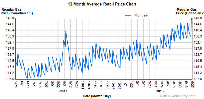
This figure shows the price evolution, but to be able to do a detailed analysis, we need the daily price values, not pixels in an image. The daily prices are extracted from the curve in the image in figure 1 using a Python program. If we visualize the extracted data, we get the figure 2.
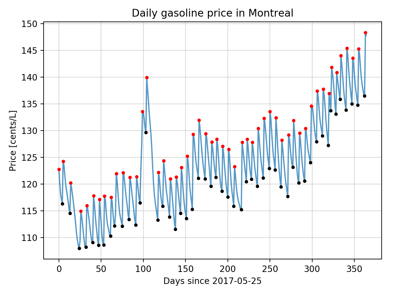
The blue curve shows the daily average price extracted from figure 1. We see that the curve’s general look is very similar to the one in figure 1, as expected. The local maximums and minimums have been highlighted using red dots and black dots respectively. Particular attention was spent making sure the local price peaks are placed at the right date, since a major part of the upcoming analysis rely on the day of the week when price hikes happen. However, it is possible that a few peaks might be off +/- 1 day because the resolution of figure 1 is about 1.5 pixels/day and the curve trait is around 2 pixels wide.
Analysis
The period between two consecutive local price peaks (red dots) in figure 2 seems very constant. We first notice that there are 52 during the year. We can therefore expect that the average period between two peaks be around 7 days. To verify, we compute the signal period spectrum which is equivalent to the frequency spectrum, but inverted. The period spectrum is displayed in figure 3.

There is effectively a strong signal peak with a period of 7 days. Knowing that, we next compute the distribution of the period between two consecutive price increases, as shown in figure 4.

Once again, we observe that the distribution’s mode is 7 days. However, there are also many periods of 6 or 8 days between two consecutive price hikes. Therefore, we cannot simply suppose that the best time to fill up your car is 6 days after a price hike.
Let’s analyze the daily price evolution after a price increase. We first visualize the evolution over 14 days of the daily price difference compared to the price at the time of the price increase. Each curve in figure 5 represents a different 14-day period after a price increase during the year. All of the increases that happened at least 14 days before May 25 2018 are included.

We observe that the majority of the curves go down in price for the first six days, then increase on the seventh day. We also see that the price evolution follows a recurrent model : a one-day increase, followed by a slow price decrease until the next single day price increase.
After computing the average difference for each day after a price increase, we get the black curve in figure 6. The red area represents two standard deviations around the average.

The minimum average difference is reached five days after a price increase. If we wait for the sixth day, there is a greater risk of a new price increase and a greater risk of a higher price than the previous price increase.
Day of the week impact
Up until now, we analyzed the frequency of price increases and the evolution of the price after an increase. However, it is quite surprising that the average period between two price increases are exactly seven days, the duration of a week. It is therefore possible that the time of a price hike is not random within a week, but linked to the day of the week. To verify this hypothesis, we first compute the distribution of local price peaks (minimum and maximum) according to the day of the week. The distribution of the minimum peaks is displayed in green and the one for the maximum peaks is displayed in red in figure 7.
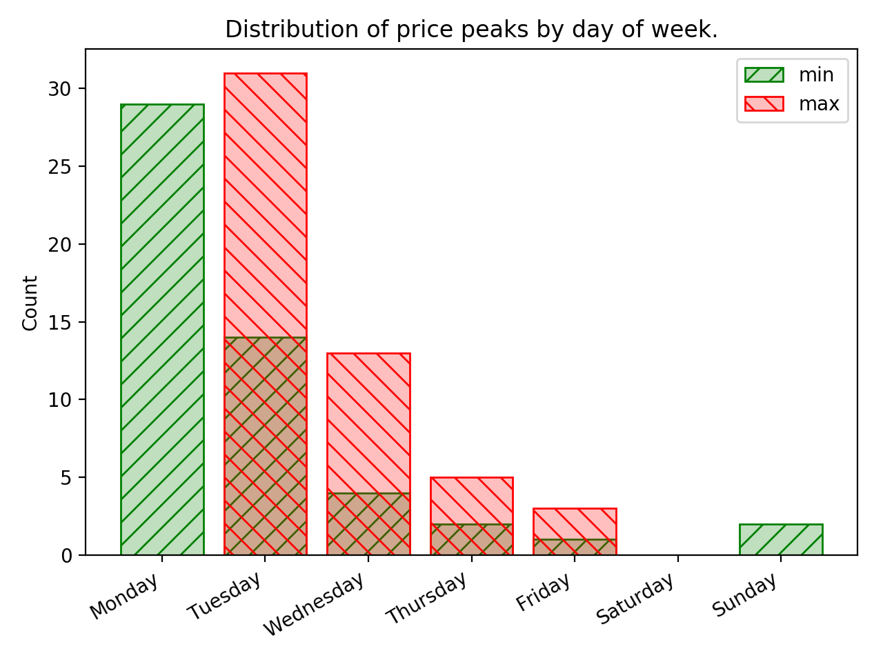
The peaks distribution demonstrates that there is indeed a correlation between the days of the week and the time of a price increase. If the time of the price increase was independent of the day of the week, the peaks distribution would tend towards a uniform distribution. The most frequent day for a price increase is Tuesday and no price increase happened between Saturday and Monday during the previous year.
This means this is probably a day during the week when the price has a tendency to be lower than the others. To verify this, we compute the average day of the week price over the year. We get the averages shown in figure 8.

The average daily price for the whole year is 123.5 ¢/L and is represented by the red line in the previous figure. We notice that there is indeed a variation of the average price based on the day of the week. To better visualize the variation, we show in figure 9 the difference between the annual average and the day of week averages.

By always filling up your car on Monday instead of doing it randomly during the week, it was possible to save 3.7¢/L on average during the year ending on May 25 2018. This represents a 3% reduction compared to the annual average. This reduction would be even bigger compared to an unlucky consumer who would have bought gasoline only between Tuesday and Friday.
Conclusion
We analyzed the evolution of the average daily gasoline price in the Montreal area for the year ending on May 25 2018. We discovered that a sudden price increase happens on average every seven days. Furthermore, these increases do not happen randomly during the week. Most often, they happen on Tuesday and they all happened between Tuesday and Friday. Thus, it was advantageous to fill up your car between Saturday and Monday during this period. It was possible to save up to 3% on your gasoline bill in the Montreal area by buying gasoline only on Monday.
This analysis is only valid for the studied year and it is impossible to predict the future. However, the sudden weekly price increase phenomenon has been going on for a long time in Montreal and it is very unlikely that it will disappear all of a sudden. Personally, I will start being more careful and try to fill up my car on Sunday or Monday when possible.
Obviously, this 3% difference is not huge. It is probably more efficient to improve your driving style or to drive a more fuel efficient car than to try to time the market to fill up your car. Regardless, it’s an easy 3% to save.
This analysis has reveled that there exists a correlation between the gasoline price and the day of the week, but doesn’t explain why. Unfortunately, I don’t have any knowledge about gasoline production and distribution, so I won’t try explaining the phenomenon. However, I find this correlation very strange. First, the weekly variation doesn’t seem to exist in other markets that I have rapidly looked at on GasBuddy (Quebec City, Ottawa, Toronto, NYC, Los Angeles). Also, in a normal/free market, this correlation should vanish over time. Imagine if the price of a publicly traded stock was following the same trend as the gas price in Montreal. An observer who saw the correlation would buy the stock on Monday to sell it after the weekly price hike between Tuesday and Friday to make a profit on each transaction. In short, the gasoline market in Montreal is strange.
The source code of the Python program used to analyze the data and generate the figures is available on GitHub.